Exterior Painting
Exterior Painting- this is one of our current jobs. Call us for your estimate- 893-0168.
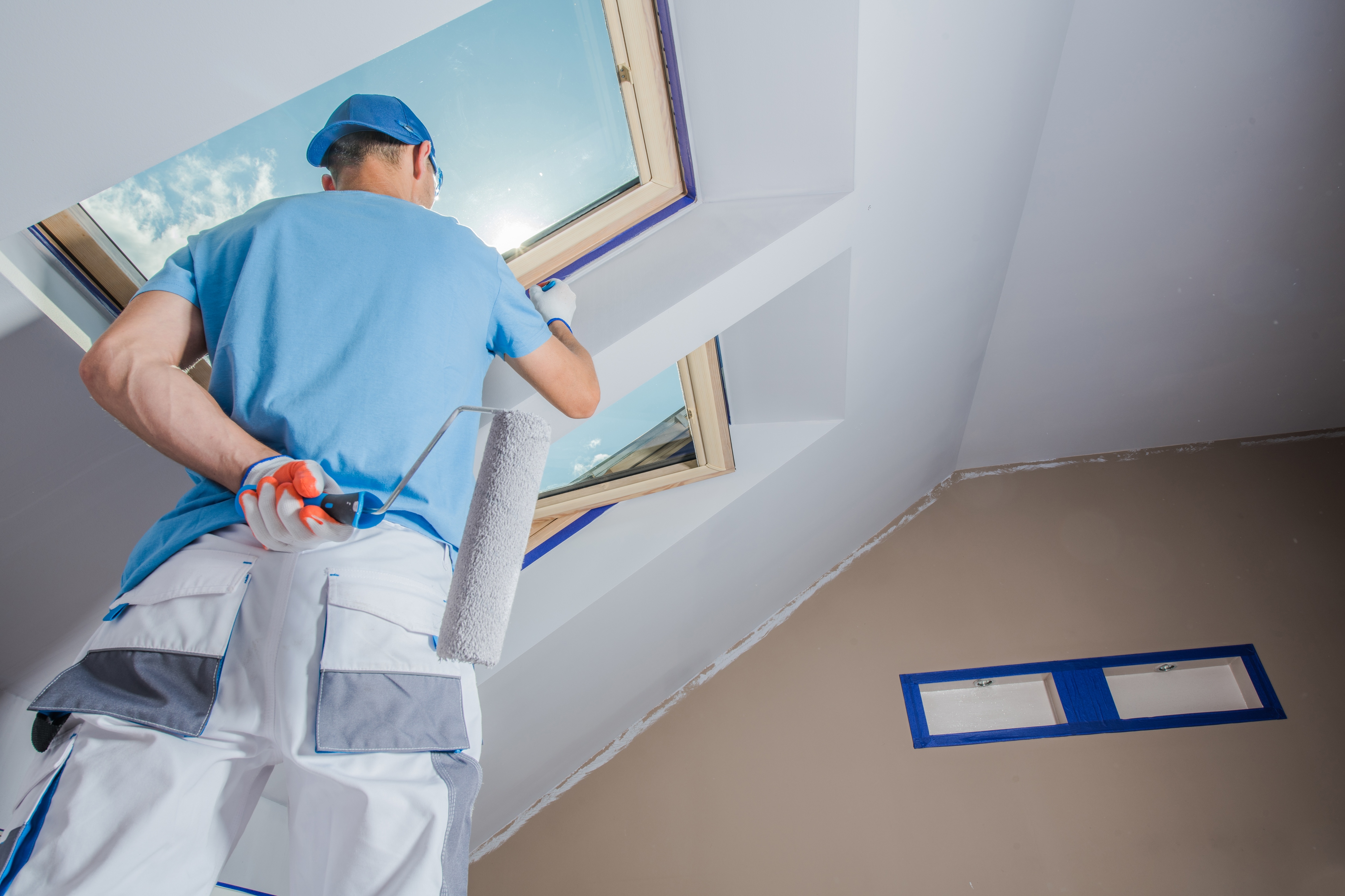
Exterior Painting- this is one of our current jobs. Call us for your estimate- 893-0168.
Painting Project We’re beginning a new project today. Let us help you with your projects. Call RiverKing Custom Painting at 850.893.0168
Please answer the questions below so we could provide you with excellent service.